
When teaching online, you probably use slides to some extent. Making slides is easy — just add a text box and an image, right? In his May workshop, Ákos Gerold shared what makes slides brain-friendly – and it’s different from what you see most people do.
Imagine you are giving a presentation. You show a slide with five bullet points, each followed by a short sentence, and discuss the topics listed. But, to see if your audience is paying attention, you sneak in a completely unrelated sentence.
When you check if anyone registered the odd sentence, most of your listeners won’t believe you said something offbeat. So you play back the audio that you secretly recorded, and their jaws drop. They realize that not only did they miss the unrelated sentence but probably most of what you said.
I do the above each time I teach presenting slides in a brain-friendly way – it helps demonstrate what is wrong with the typical use of slides in every industry, including education.
Multi-tasking is a myth
Neuroscientists have proven that the brain cannot pay attention to more than one source of information at the same time. When we show slides while we speak, the visual almost always wins over the auditory.
The result is that our audiences and students are unable to hear most of what we are saying while absorbing visual input.
Switching is detrimental to learning.
When they finish reading, they will shift their attention back to us. But the next slide will hijack it again.
Such switching is detrimental to learning.
So what can we do about it?
Make it as easy as one, two, three…
Whenever possible, reduce the amount of visual input in each slide to what can be absorbed in two to three seconds.
This roughly translates to an image and up to three words. Make sure you use the exact words from the slide and synchronise what you say with when those words appear on the screen. Such little and synched visual information will not distract your learners’ attention from your verbal message but support it.
How can you know what words are on the next slide and how can you synchronise perfectly? Using presenter mode in PowerPoint or Keynote allows you to see the current and next slide along with your notes. When sharing your screen in Zoom or Teams, only share the part of the screen with the current slide.
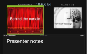
The green frame shows what part of the screen is shared in Zoom.
Keep it short and sweet
Say goodbye to bullet points and full sentences. Making them appear all at once will introduce visual stimuli that take longer to absorb than two to three seconds.

Instead, break down bullet point lists into separate slides for each point, reduce the text to its essence and synchronise when delivering.

If it is important to explain the link between the bullet pointed pieces of information, e.g. because they are part of a system, then keep them on the same slide. Just make them appear one by one as you introduce them and grey out the ones you are currently not talking about. Again, the text on each slide should be shortened to its essence.

Tips for longer texts
When you need to show visual information that exceeds what can be absorbed in two to three seconds, e.g. longer text, follow a three step procedure.
1. Before you click to the detail-heavy slide, say:
a) what you are going to show
b) how long the students will have to read it, and
c) what you will do afterwards.
Example: “Now, I will show you a short text about X, I will give you a minute to read it and then we will focus on some of the sentences which demonstrate a grammatical point we will deal with today.”
2. Stop speaking – they will be unable to hear what you are saying while reading anyway – and show them the slide.

3. After the announced time is up, briefly repeat what you will do next and then do it.
Example: “Let’s look at some of the sentences which show us how [grammatical structure] is used.”
Then click to the next slide, where everything but the sentence(s) which you wish to analyse is greyed out.

More brain-friendly slide design tips
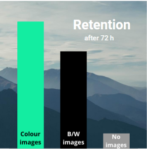
Add a related image whenever you can. — Tested 72 hours after exposure, the retention of the content of a presentation that used only text in the slides is 10%. This number climbs to 65% if the slides include black and white images and up to 85% in the case of colour pictures.
Do colours matter? — Due to its resemblance to a large, shiny object, a light background attracts more attention to the slide than to the speaker. Respectively, the opposite colour combination gives the latter more prominence. Thus, a dark background with light letters is often better.

To screen share, or not to screen share, that is the question. — You may often start sharing your slides at one point during class and then keep sharing till the end, relegating yourself to a small screen in the corner. But humans connect with other humans, not slides. Therefore, whenever possible, exit screen sharing to facilitate connecting with your students.
As you can see, most widespread slide practices are unfortunately not aligned with how the brain works. This is because they are based on what we see in printed media. But magazines, newspapers and books are very different from presentations and online teaching.
***
To find out more about what makes presentations brain-friendly, check out my website, YouTube channel or LinkedIn page.